 ultimate-guide
Custom Logo Placement for Professional Uniforms
Table of Contents
- Why Logo Placement Matters on Professional Uniforms
- Standard Embroidery Placement for Polo Shirts and Button-Downs
- Best Practices for Sleeve Logo Placement
- Logo Size Guidelines for Work Uniforms
- Decoration Methods and Their Impact on Placement
- Industry-Specific Placement for Medical, Hospitality, and Construction Uniforms
- Choosing the Right Placement for Your Team
- Conclusion
Last Updated: August 25, 2026
Why Logo Placement Matters on Professional Uniforms
The placement of a custom logo on professional uniforms directly affects how your brand is perceived, how long your investment lasts, and whether your team looks cohesive. A logo positioned poorly can interfere with seams, stretch unevenly, or become obscured by equipment and movement. The right placement enhances professional appearance, ensures brand visibility, and protects garment integrity.
Placement affects more than aesthetics, it influences durability. A logo positioned over a seam or zipper experiences constant friction and stress. Heat transfer logos placed too close to armholes can crack with arm movement. Embroidery in high-friction areas wears faster.
This guide covers the practical decisions that separate professional-looking uniforms from hastily assembled ones, including industry standards, decoration method considerations, and the specific factors that determine whether a placement choice will work for your situation.
Standard Embroidery Placement for Polo Shirts and Button-Downs
Embroidery remains the gold standard for professional uniforms because it's durable and projects quality. Placement locations have become standardized across industries for good reason, they balance visibility, garment integrity, and professional appearance.
Left Chest Placement
Left chest placement is the most common embroidery location for professional uniforms. This position sits on the pectoral area, roughly 2-3 inches below the shoulder seam and centered horizontally on the chest, offering consistent visibility whether someone is standing, sitting, or moving.
Left chest placement works because it avoids major seams in most garment constructions. The chest area on quality polo shirts and button-downs is relatively flat, providing a stable surface for embroidery without fabric stretch complications. For embroidery specifically, this location typically accommodates logos up to 3.5 inches wide without running into seam issues.

The exact vertical placement matters more than people think. Positioning approximately 1.5 inches below the shoulder seam feels naturally balanced on most body types and sizes. Too high looks awkward and interferes with neckline construction; too low appears sloppy.
Right Chest and Full Front Options
Right chest placement mirrors the left side and works identically from a technical standpoint. Some industries prefer right chest for specific reasons, healthcare facilities sometimes use left for facility branding and right for individual credentials or certifications.
Full front placement, a larger logo spanning much of the chest area, works for specific situations but requires careful consideration. Full front logos need simpler designs because embroidery complexity increases dramatically with size. A logo that looks sharp at 3 inches wide might lose detail at 6 inches. Full front embroidery works best when your logo is relatively simple and geometric.
Back of Garment Branding
Back placement offers high visibility in certain contexts, restaurant uniforms where customers see staff from behind, or event staff uniforms where the back is prominently displayed. Back placement avoids front-facing visibility concerns and works well for larger logos because the back typically has more uninterrupted fabric space.
However, the upper back area on most garments has a yoke seam running horizontally across the shoulders. Embroidery that crosses this seam can experience puckering and distortion. Positioning embroidery below the yoke, roughly centered between the shoulder blades, avoids this problem. Most garments have a vertical seam running down the middle of the back; logos that straddle this seam need to be designed to work with it.
Best Practices for Sleeve Logo Placement
Sleeves present unique challenges because they're constantly moving, stretching, and flexing. The fabric experiences more stress on sleeves than almost anywhere else on a garment, which means placement decisions directly impact durability.
Sleeve Hem Positioning
Sleeve hem placement, embroidery or printing near the cuff, is popular because it's visible and avoids major seams. The sleeve hem sits on relatively stable fabric that doesn't experience as much stretch as the upper sleeve. For embroidery, this location works well for smaller logos, typically 1.5 to 2.5 inches wide.
Sleeve hem placement has a significant advantage: it's far from the armpit area where friction and sweat accumulation are highest, naturally extending the lifespan of your decoration. Centering the logo on the outer forearm maximizes visibility.
Upper Sleeve and Shoulder Considerations
Upper sleeve placement, near where the sleeve meets the shoulder, offers better visibility than hem placement but introduces seam complications. The shoulder seam where the sleeve attaches creates tension and movement. The solution is positioning embroidery slightly below the shoulder seam, on the upper arm area where the fabric is more stable.
Upper sleeve placement works best for simpler logos because the curved surface of the arm creates natural distortion. A logo that looks perfectly straight on flat fabric might appear slightly warped on the curved sleeve surface, this is the geometry of fabric on a cylindrical shape, not a flaw in execution.
Logo Size Guidelines for Work Uniforms
Logo sizing is determined by visibility requirements, decoration method capabilities, and garment proportions. A logo that's too small becomes illegible from normal viewing distance; too large and it overwhelms the garment.
Scaling for Different Decoration Methods
Embroidery works well down to about 1 inch wide, but below that size, fine details start to disappear (peer-reviewed research). The stitching resolution has practical limits. Screen printing can handle smaller details than embroidery but still has practical limits, fine lines thinner than 1/16 inch become problematic. Heat transfer (both traditional and DTF methods) offers the most flexibility for detail and can scale down smaller than embroidery or screen printing.
For professional uniforms, the sweet spot for most logos is 2.5 to 4 inches wide. This size range is large enough for good visibility and legibility, small enough to look balanced on most garment placements, and achievable with all three major decoration methods without compromise.
Visibility and Professional Balance
Visibility and professional appearance sometimes pull in different directions. A massive logo dominates the garment and screams "advertisement" rather than "professional uniform." A tiny logo looks cheap and unprofessional. The goal is sizing that makes your logo visible without overwhelming the wearer.
Consider the viewing distance. A logo on a polo shirt worn by someone standing across a room needs to be larger than a logo where people are typically within arm's reach. Professional appearance also depends on proportion to the garment. A logo that's 6 inches wide on a small women's XS shirt looks oversized; the same logo on a men's 2XL looks proportional.
Decoration Methods and Their Impact on Placement
Your choice of decoration method, embroidery, screen printing, or heat transfer, directly determines which placements are viable and how your logo will perform over time.
Embroidery vs. Screen Printing vs. Heat Transfer
Embroidery uses thread stitched through the fabric, creating a raised, textured logo. This method is extremely durable and looks premium, but it requires stable fabric and can't be placed over seams without complications. Embroidery also has practical limits on how small details can be before they become unstitchable.
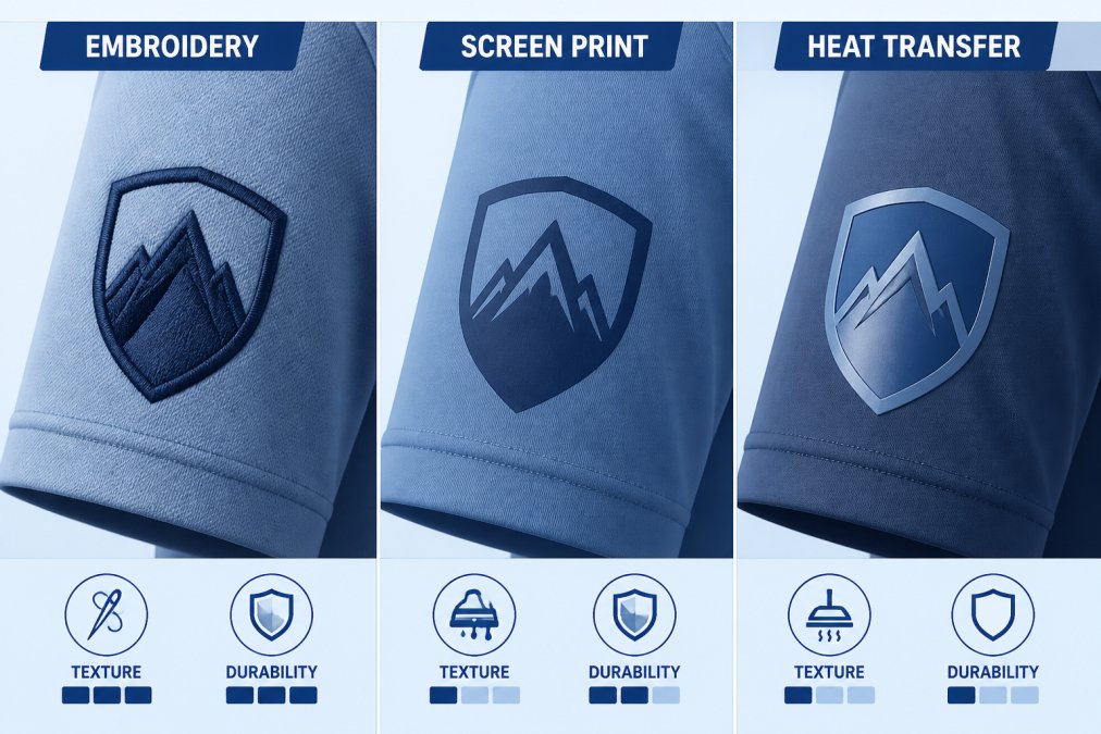
Screen printing applies ink directly to the fabric surface. It's cost-effective for larger orders and produces vibrant colors, but it sits on top of the fabric rather than being integrated into it. Screen printing can crack if placed over high-flex areas or if the garment is stretched aggressively during wear.
Heat transfer methods (traditional heat transfer, sublimation, and DTF) apply a design to fabric using heat. These methods offer excellent color reproduction and can handle complex designs with many colors. DTF specifically offers better durability in stretch applications than traditional heat transfer. However, heat transfer placement matters because the transfer can peel if placed in areas with constant friction or excessive stretching.
The practical implication: embroidery works best for placements on stable fabric areas like the chest. Screen printing is versatile but should avoid high-flex areas. Heat transfer, particularly DTF, can work in more locations but requires careful placement to avoid peeling in stress zones.
Garment Integrity and Seam Interference
Garment integrity means the structural soundness of the garment itself. Decoration placement that interferes with seams, zippers, or structural elements compromises durability and can cause the garment to fail prematurely.
Embroidery placed directly over a seam creates a double-thickness of thread and fabric, which causes puckering and distortion. Screen printing over a seam can crack because the seam creates a rigid line that doesn't flex the same way as surrounding fabric. Positioning embroidery or screen printing at least 1 inch away from any zipper is a practical rule (the CDC).
The armpit area, side seams, and gusseted areas experience significant stretching during movement. Embroidery in these areas can crack because thread doesn't stretch the way fabric does. Heat transfer in these areas can peel for the same reason. These high-movement zones should either be avoided entirely or use decoration methods specifically designed for stretch.
Industry-Specific Placement for Medical, Hospitality, and Construction Uniforms
Different industries have specific placement conventions that have developed for practical reasons.
Medical uniforms typically use left chest placement for facility branding, often with right chest placement for individual credentials or certifications. Medical staff uniforms need to accommodate stethoscopes and other equipment, so placement needs to account for these functional requirements. Sleeve placement is common for medical uniforms because it avoids equipment interference.
Hospitality uniforms, restaurant staff, hotel uniforms, casino uniforms, frequently use back placement because customers see staff from behind. Front placement is less common in hospitality because the focus is on how the uniform appears to guests. Back placement dominates, while sleeve placement is less common.
Construction and workwear uniforms prioritize durability and visibility. Left chest is standard for company branding. Back placement is common for safety compliance or company identification. Sleeve placement is frequent because construction work involves constant arm movement, and sleeves are visible even when arms are working.
The practical takeaway: your industry likely has established placement conventions for good reasons. Following those conventions ensures your uniforms look professional within your industry context.
Choosing the Right Placement for Your Team
The decision about where to place your custom logo depends on multiple factors specific to your situation. There's no universally correct answer, only the right answer for your particular circumstances.
Assessing Fabric and Garment Features
Start by examining the actual garment you're using. Look at seam placement and identify where major seams run, shoulder seams, side seams, the center back seam. These are no-go zones for embroidery. Check for zippers, buttons, or other hardware and map out how far away you need to stay from these elements. A zipper on a jacket requires at least 1 inch clearance.
Assess fabric type. Stretchy knits behave differently than woven fabrics. If your uniform uses a performance fabric with significant stretch, certain placements work better than others. Embroidery on highly stretchy fabric is risky unless positioned in low-flex areas. Screen printing on stretch fabric requires flexible ink formulations. Heat transfer, particularly DTF, handles stretch better than traditional methods.
Consider the garment's intended use. Will wearers be sitting for extended periods, or are they constantly moving? Will the uniform interact with equipment, machinery, or customer contact? These factors influence which placements will hold up over time.
Digital Mock-Ups and Design Verification
Before committing to production, use digital mock-ups to verify your placement choice. A good mock-up shows your actual logo on the actual garment you're ordering, in the actual size you're planning. This catches problems before they become expensive mistakes.
Digital mock-ups reveal whether your logo size looks proportional on the garment and how the logo interacts with the garment's shape. Chest placement that seemed perfect in theory might look awkward when you see it on an actual garment silhouette. Back placement might be higher or lower than expected. Sleeve placement might be more or less visible than anticipated.
When working with a vendor like Action Designs, request mock-ups before production. Provide feedback on the mock-up, not after samples arrive. Verify that your decoration method choice is appropriate for your placement. The most common mistake in this phase is skipping the mock-up step to save time.
Getting custom logo placement right is the difference between uniforms that look sharp and professional versus ones that look hastily assembled. The placement decision affects visibility, durability, professional appearance, and how much your team actually enjoys wearing the uniform.
Action Designs specializes in helping teams navigate these placement decisions with digital mock-ups, experienced guidance on decoration method selection, and production that respects the structural integrity of the garment. Whether you're outfitting a small medical practice, a hospitality team, or a construction crew, the right placement strategy ensures your investment in professional uniforms actually delivers professional results.
Ready to get your custom uniforms right? Get a quote from Action Designs and work with a team that understands that placement precision matters.
Frequently Asked Questions
What is the standard industry placement for a left chest logo on professional uniforms?
Left chest placement is the most common standard for professional uniforms. Position the logo 2-3 inches from the left shoulder seam and approximately 2 inches below the collar. This placement provides excellent brand visibility while maintaining a balanced, professional appearance. For embroidery, ensure the design doesn't interfere with seams or buttons. Screen printing and heat transfer can be placed slightly lower without garment integrity concerns.
How do you determine the right logo size for work uniforms?
Logo size depends on placement location and decoration method. For left chest embroidery, aim for 2-4 inches in width. Sleeve logos should be 1-2 inches. Full back placements can accommodate 4-6 inches. Ensure logos scale appropriately for your design's complexity, intricate multi-color logos need more space than simple single-color marks. Always request digital mock-ups before production to verify sizing and visibility on the actual garment.
What are the main mistakes to avoid when placing logos on employee uniforms?
Common mistakes include placing logos too close to seams or zippers, which causes garment integrity issues; sizing logos too small for visibility; ignoring fabric stretch and texture differences; and failing to account for the decoration method's limitations. Avoid placing embroidery directly over seams or in high-stress areas. Don't use overly complex designs on small placements. Always test placement on sample garments before full production runs.
How does logo placement differ between embroidery and screen printing?
Embroidery requires placement away from seams, zippers, and high-stress areas to avoid garment damage and digitization issues. Screen printing is more flexible since ink sits on the fabric surface and doesn't require stitching. Heat transfer offers similar flexibility to screen printing. For embroidery on polos, stick to left chest or back yoke placement. Screen printing allows more creative positioning, including full front, sleeves, and lower back placement without structural concerns.
This article was written using GrandRanker